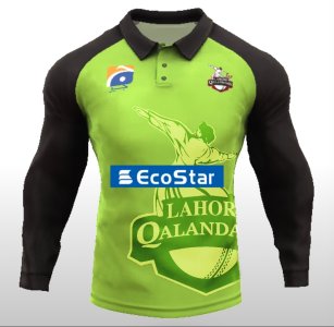
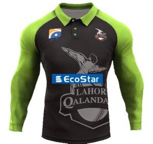
LQ- i dont like how the red logo completely mismatches a green jersey so i brought in the deep red with shades of green. The jersey shows a gateway entrance to Badshahi Mosque. The deeps space fits because Qalandars means Spiritual and a mosque is a Entrance to it.
PZ- the pillars of Kyhber Pass has been implemented whilst kerping their Honeycomb like design.
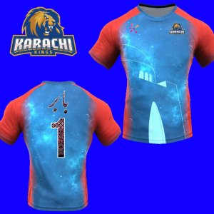
KK- instead of looking like harpic bottles ive given the kit a mystic blurry blue to highlight karachi's coast with streams of red in it to maintain original jersey theme.
IU- The logo's son embodied into the jersey in a pattern you would find in Punjabi Textiles
QG- Textures of Balochi Design patterns as the bg of the jersey with a gladiators shield using the theme of lights you would find on a rickshaw/truck
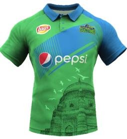
MD- Multan is perfect, wont fix what isnt broken.
")
 (5).jpg")
 (4).jpg")
 (3).jpg")
 (2).jpg")
 (1).jpg")