What's new

[PICTURES] PSL 7 Kits thread

MenInG

PakPassion Administrator
Staff member
Joined
Oct 2, 2004
Runs
218,133
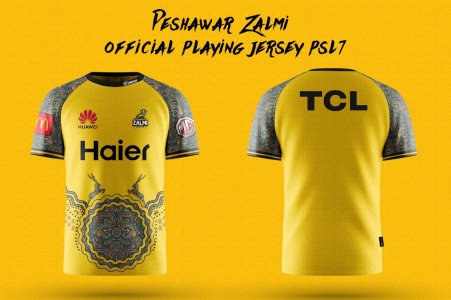
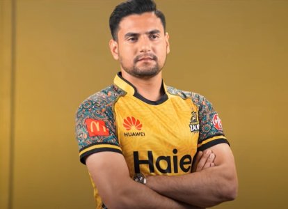
Peshawar Zalmi first with their kit for PSL 7

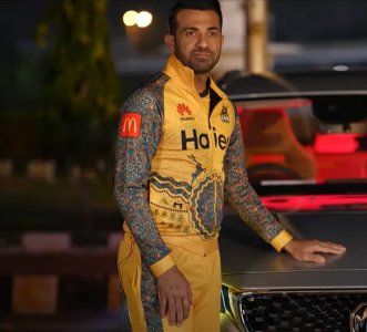
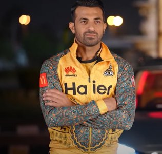
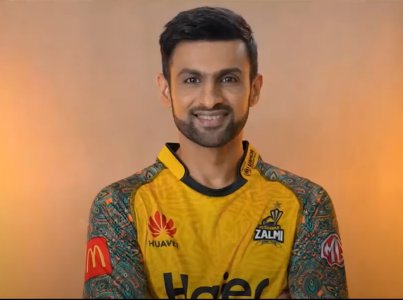
Zalmai Superstars Wahab Riaz, Shoaib Malik, Kamran Akmal, Usman Qadir, Hussain Talat can be
seen donning the color of Zalmi in the kit reveal video.
Peshawar

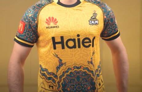
Zalmi Kit is designend to represent the historic city of Peshawar and Pakistan’s
national animal Markhor, Javed Afridi, Chairman Peshawar Zalmai

Peshawar Zalmi has launched its playing kit for the seventh edition of Pakistan Super League
which is starting from 27th January. Zalmi Kit is inspired from the city of Peshawar and Markhor.
The traditional designs of Peshawar which is also known as the city of flowers has been included
in the kit, as well as representation of histotic locations of Peshawar and Khyber Pakhtunkhwa
including Islamia College, Ghantaghar Peshawar, Khyber Pass and K2. Pakistan's national animal
Markhor has also been featured on the shirt.
78d4208f-d143-4031-8aa4-8c834063f53b.jpg

564516e9-4be5-4388-a563-139d063aa0f5.jpgbfa2f1e9-a853-4ebe-8e08-325cbd1e410d.jpge24e5429-a75c-4839-a940-161a4483b399.jpgedef9d28-4e55-4eed-a16b-e77c7fc423dc.jpgfe3456d4-f008-4845-9b2e-99fc9b4eb8ac.jpg20a0780d-b555-4b04-a7c7-8eecde0d067d.jpg
 
Last edited:
One thing that makes me jealous of the zalmis is there branding. By associating with top brands the zalmi brand itself has become a high end brand in psl.

Mcdonalds, huawei and MG. Even Haier is a decent sponsor
 
A little too much of culture. Looks more like a Shaadi outfit than a playing kit tbh
 
I like the idea and all but I think it's a bit overboard, something a little less intricate would have been better I feel.
 
It is a great-looking kit. The one last year was slightly better but this one is up there as well.
 
Really hope LQ drop the green and grey combo this time.
 
great idea to put a giant circle on the belly, accentuate kamis curves.
 
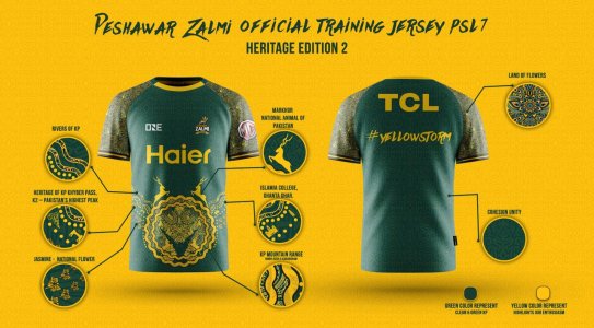
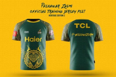
Peshawar Zalmi's training kit launched for PSL Seven.

The training kit highlights the culture of Khyber Pakhtunkhwa.

Peshawar Zalmai's Training Kit Launched for PSL Seven. The training kit highlights the culture of Khyber Pakhtunkhwa. The green training kit features truck art patterns and highlights the mountain range of the province. Khyber pass, Islamia College and Ghanta Ghar are also part of the kit.

The national animal Markhor and the national flower Jasmine are also prominent on the kit, along with Pakistan's highest peak K2 is also present on the kit.

7d9f1b96-7175-4646-aa95-de368aa8bcd2.jpgaef5e5c8-d432-4c01-b266-f68811a12d45.jpg
 
What a horrible design, are these men kits aur Pakistani ladies suit? Very ugly outfit for men wear ! ! !
 
Looks like they tried to combine a flashy mehndi / wedding suit with a cricket kit.

Looks far too busy, too much going on, tacky.

I prefer kits to be simple. Each to their own, I suppose.
 
What are the other Franchises doing? Where are their kits? Fan Engagement? And then they have the audacity to complain about losses? If you don't invest and spend properly on your franchise and run it like a 24/7/365 business then how do you expect to develop the brand?
 
They have really good ideas, and the sponsors used for their kits are brilliant and don't ruin their list.

But unfortunately, this maint kit just doesn't look nice, it does look like a ladies dress. Instead of doing the pink, light blue + yellow colour combination for the heritage design on the shoulders plus that circle, they should have gone with the navy blue and black (plus yellow) as those are the Peshawar Zalmi colours. And although the circle is meant to represent a lot about the heritage and therefore meant to be a key aspect of this kit, I would get rid of it, it just doesn't fit well at all, there is enough heritage design on the shoulders (and that rib sort of part).

The training kit (Heritage edition 2) looks much better, but once again, get rid of the circle and it will look even better.


As a Qalandars Fan, their green and grey kit is just too embarrassing now, I'm not looking forward to their kit reveal. The grey is awful, but what is even worse is the shade of green they have chosen. If they are going to stick with green and grey, at least choose a better green shade, as the one Sydney Thunder have.
 
But end of the day, a lot of credit and praise should go to Peshawar Zalmi, as they try to do new things as they have done with their kits.
 
Ugh, looks like some kind of henna design on their sleeves. And that floral design on the tummy is 😂😂
 
Tournament is only 10 days away & 5 out 6 franchises haven't released kits, this is beyond pathetic from the franchises. This truly shows that PSL is a 3rd grade tournament.
 
Tournament is only 10 days away & 5 out 6 franchises haven't released kits, this is beyond pathetic from the franchises. This truly shows that PSL is a 3rd grade tournament.

Quetta and Lahore hardly ever make changes to their kits, so that’s 3 teams left.
 
I am not even excited about this psl. Being held way too early, and there might be games effect by the weather.
 
PSL has so much untapped potential when it comes to merchandising. But franchises are too stupid and visionless when it comes to making use of it.
 
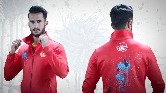
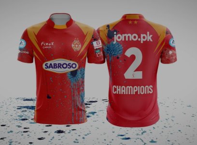
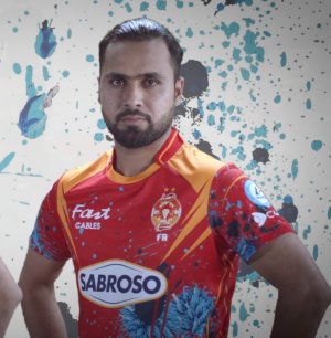
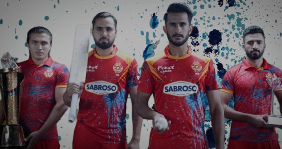
Does anyone know the reason behind the blue splash marks on Islamabad reason, like what is it suppose to represent. Personally dont like this kit at all.
 
Does anyone know the reason behind the blue splash marks on Islamabad reason, like what is it suppose to represent. Personally dont like this kit at all.

According to ISLU

World’s first cricket & art collaboration on display.
 
That blue splash look so out of place. I think even Faisal Bank t20 tournament had better creative teams when it came to designing kits.
 
Whats Musa done to his hair, without sounding rude i honestly thought Islamabad were ahead of the curve and started a ladies team too.

Does everyone need to have the same hairstyle and facial hair like a clone? Let people express their individuality without judgement.
 
Does everyone need to have the same hairstyle and facial hair like a clone? Let people express their individuality without judgement.

im all for freedom of expression, but it works both ways, if your going to be a pin up boy for the marketing campaign then people should be free to have their opinions on that aswel.
 
According to ISLU

World’s first cricket & art collaboration on display.

I am all for art collaboration, but you can do something much better than that surely. IM sure 90 percent of people will not like this kit haha
 
Looks like they have been painting and spilled paint over their shirt
 
Peshawar Zalmi first with their kit for PSL 7

Zalmai Superstars Wahab Riaz, Shoaib Malik, Kamran Akmal, Usman Qadir, Hussain Talat can be
seen donning the color of Zalmi in the kit reveal video.
Peshawar

Zalmi Kit is designend to represent the historic city of Peshawar and Pakistan’s
national animal Markhor, Javed Afridi, Chairman Peshawar Zalmai

Peshawar Zalmi has launched its playing kit for the seventh edition of Pakistan Super League
which is starting from 27th January. Zalmi Kit is inspired from the city of Peshawar and Markhor.
The traditional designs of Peshawar which is also known as the city of flowers has been included
in the kit, as well as representation of histotic locations of Peshawar and Khyber Pakhtunkhwa
including Islamia College, Ghantaghar Peshawar, Khyber Pass and K2. Pakistan's national animal
Markhor has also been featured on the shirt.
View attachment 114068

View attachment 114062View attachment 114063View attachment 114064View attachment 114065View attachment 114066View attachment 114067

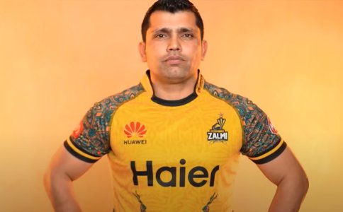
Did they really need Kamran Akmal to model this?

He is such a bad advertisement from a marketing pov
 
Three awful kits so far.
PSL is really a mediocre league at this moment I'm waiting for the Pakistan Cup instead of these Pyjama Leagues.
 
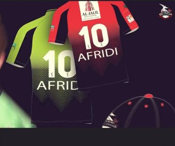
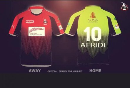
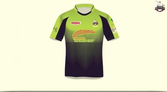
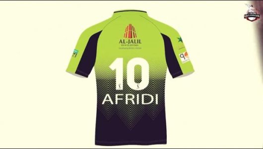
Lahore Qalandars home and away kits launched:

EC7A485E-1152-4BCD-94FE-81E6EC4F06C5.jpg

EBB3BFCE-E365-4E3A-8FE1-7CCC36896F25.jpg


More pics of the home kit:

CDF3B1EE-19D5-4A18-99C8-A784D49FCC34.jpg

E5B94726-20EA-46DF-99D6-20E36C3B080F.jpg
 
I like the Karachi Kings kit but other than that some pretty awful looking kits. LQ is by far the worst. IU by far the most laughable.
 
Psl kits so far have been ugly.
Dont suspect a nice kit from multan either. However i think quetta will have a nice one. Their colors of purple and gold are usually spot on.

Lahore i am happy they brought back red and black but its a shame its the away kit that being said both kits the black and green are okay at most.

Islamabad, karachi and peshwar kits have been dissapointing

The current Multan Sultans kit (in PSL 6 and similarly PSL 5) with the blue and green are both very nice kits. That kit is 10 times better than all of these kits
 
LQ's away kit is pretty reasonable. Actually anything other than their green and gray kit is good.
 
Never liked the red/blue combination of KK.

In my opinion the 2 colours don't go well together.

KK should try a dark blue/light blue combination.
 
Once you see the players wearing on the field and for us on the TVs then we should really judge if these are awful or good.
 
This is going to be worst PSL with regards to kits. All the kits released so far are kits are awful so far.
 
The home & away idea by LQ is a good idea which more franchises should follow.

It's a nice idea & If I'm not wrong Islamabad did the same thing in PSL 5 but it's pointless to use home & away kits if you're playing all matches in 1 or 2 venues.
 
Never liked the red/blue combination of KK.

In my opinion the 2 colours don't go well together.

KK should try a dark blue/light blue combination.


I disagree, it’s just that KK has a crap kit designer.

All it takes is 5 mins to design a kit that actually looks much more elegant than the official kits, that’s how low the standards are.

Here’s my design.

F88CD074-D1BE-475D-9ECF-2033DC4B8B4F.jpg

:shafiq2
 
Kits are okay, I will would like to see them actually in action before forming a firm opinion because, as per my experience many kits look good as images but not on TV/match while some look a bit questionable as images but lit up the screens.
 
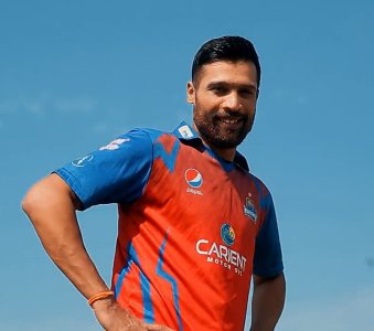
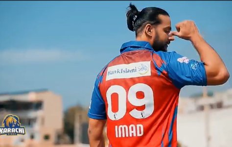
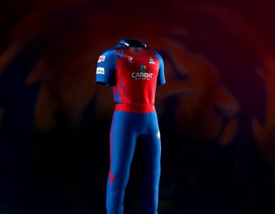
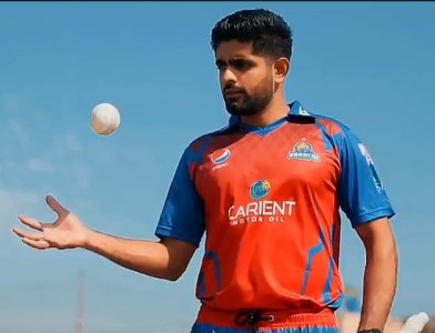
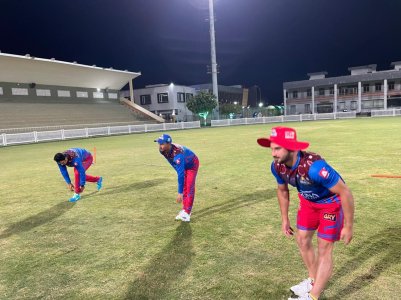
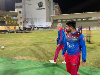
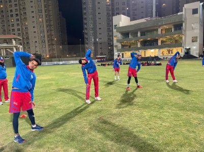
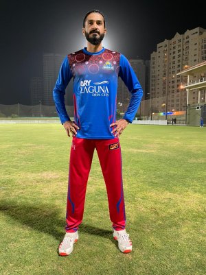
New practice kits for the Kings at the night practice at Moin Khan Stadium

94c38a73-c446-4bd2-90e1-f622cf8cd2ee.jpg8e11c0b9-d634-4d67-baeb-8379ec4f5d19.jpg9f3a2302-0bd8-4d51-a68b-769fc5abe30c.jpgc5876943-e882-48e9-96b5-67f205f944d7.jpg
 
Karachi’s blue and red match kit does look nice.

The green present in Lahore also nice to have.
 
Karachi looks amazing this time. They really made the red and blue compliment each other really well. Shades of both colors look energetic.
 
Quetta Gladiators

ZBlFNmI.jpg
 
Last edited by a moderator:
Quetta Gladiators

ZBlFNmI.jpg

That looks decent IMO, I definitely prefer this one over their previous kits, but we will have to see it when they play to properly judge. If that meiji sponsor is removed then it will look x10 times better immeditaley.
 
So after seeing all the kits, this is the worst PSL in terms of kits (however, I do also believe PSL 7 will be the worst PSL season ever).

Peshawar kit had good ideas, and good potential, but its not a nice kit at all, and it does look like a ladies dress, mainly because they chose the wrong colour combination, and the circle doesn't fit well.

Islamabad kit is starught up stupid.

Lahore is the worst one, it really looks like it's designed by some 13 year old who made it in their spare time in school.

Karachi and Quetta have good kits though.

Multan doesn't count since it's the exact same as last season (however, technically I would rank the Multan kit as the best).

But one serious issue is shoving sponsors into kits, and not just for the kits but for everything.
 
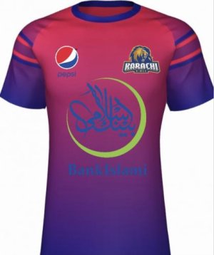
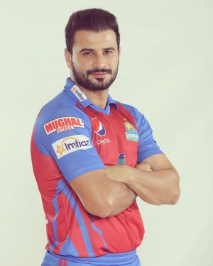
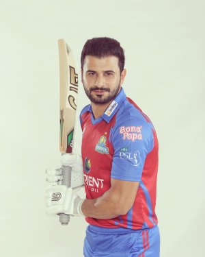
Seems playing kits is different for Karachi

View attachment 114384View attachment 114385

Remove the Bona Papa, Imtiaz, Mughal Steel logo sponsors, and then switch the Pepsi with the PSL logo (so that the PSL logo is on the front while Pepsi logo is on the shoulder), and that makes the kit look 100 times better, and I'm not even being sarcastic.

PSL is shoving sponsors into everything related to the PSL, its became too annoying now.
 
Quetta has the best kits hand down.

Here is how i would rank the kits IMO

1) Quetta
2) Multan
3) Karachi
4) Peshawar
5) Lahore
6) Islamabad ( had they got rid of the blue splash on the jersey, this kit could look decent, it ruins everything)
 
So I thought Lahore had the worst kit, but I think now I would say United have the worst kit after they played their first match. The red wasn't even red it was the weird pink colour. Yes I know it was daytime, but the colour still shouldn't look the weird pink that it was. Plus the blue paint splashes are clueless.
 
It also doesn't make sense at all as to why Lahore Qalandars didn't play in their green kit against Karachi Kings, since Karachi also has the red.
 
IU's kit is like the packet of RIO biscuit(pink one)..

I can't understand why it's pink. In the photos it looks orange, orange is their colour they've been going with and I thought they were the only team consistent with the colour scheme and designs. It wouldn't be this bad if it was orange.
 
I'm not sure that the Islamabad Pink kit is their away kit, they've been wearing the pink kit for all the matches they have played...
 
Back
Top